QUESTION ONEHow does your media product use, develop or challenge forms and conventions of real media products?
Theories:
Challenges:
David Buckingham (Children Talking Television, 1993): 'genre is not... simply "given" by the culture: rather, it is in a constant process of negotiation and change' With this in mind, I decided to challenge certain generic characteristics because of my target audience; it isn’t a conventional target audience and I therefore needed to ‘negotiate and change’ certain aspects of my products to.
David Buckingham (Children Talking Television, 1993): 'genre is not... simply "given" by the culture: rather, it is in a constant process of negotiation and change' With this in mind, I decided to challenge certain generic characteristics because of my target audience; it isn’t a conventional target audience and I therefore needed to ‘negotiate and change’ certain aspects of my products to appeal a lot more to my target audience.
How my product challenged the conventions of local newspapers

—Colour scheme: My newspaper challenges the norms of local newspaper colour schemes as it uses a lot more colour than most local newspapers. This was a deliberate attempt however as it will appeal to my target audience as the vibrancy and energy will attract them more.
Another reason why this would appeal to my target audience is because they actually requested for this colour scheme; in an interview with members of my target audience, a few of them suggested that it should be distinctively colourful from the normal newspapers but not so much so that it doesn’t actually look like a newspaper.
This will all help create a preferred reading for my target audience as they will feel as though they are represented and can associate themselves with the content of my 3 products.
How my product conformed to the conventions of local newspapers.
I based a lot of my ideas on the theory created by Jacques Derrida: (The law of genre, 1981): 'a text cannot belong to no genre, it cannot be without... a genre. Every text participates in one or several genres, there is no genreless text'.I thought this to be very true as a lot of my ideas were inspired by examples which I decided to take and develop more into my ideas. For instance my Ancillary task 1 (newspaper poster) was inspired by The Guardians Fact and Opinions advertisement. It was vibrant and colourful and attracted me especially because it held no images but had a lot of creativity.
Font/ Fonts sizes: I followed the conventions of hierarchical font sizes which I got from my research and development stages of my portfolio. For instance, if the font of the masthead is 68, the lead headline must 6-8 smaller.
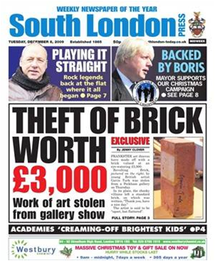
Layout of newspaper front page and feature page: I followed case studies such as South London Press and The Metro to identify and find out how to construct my newspaper in a way that reflects the generic conventions of newspaper texts.
Steve Neale (Questions of genre, 1990): “genre contributes to the regulation of desire, memory and expectation” I this theory also applies to my reasoning behind following conventions; I’d like my target audience to ‘remember’ that my newspaper is indeed a newspaper and that means conforming to certain types of conventions and looking like it. With them remembering this, I’d like them to ‘expect’ the articles to be constructed in a way that is similar to conventional newspapers; the only difference between the two would be the content. This means structuring not only the content of my newspaper but the layout of it to create a sense of ‘desire’ for my newspaper by my target audience.
QUESTION 2:
How effective is the combination of your main product and ancillary texts?
How it was effective
—Text vs Visual: I decided to construct my newspaper in a way that reflects all our senses. My newspaper was intended to give an informative idea of how L.Y.T operates in terms of the content. My newspaper poster was meant to visually reflect my target audience and give an indication on the ethos of my newspaper and my radio advert was supposed to give an aural idea of the same concept.
My ancillary tasks I thought was very effective as it gave a variety of ways for people to know about my newspaper; the radio advert is just one of the many ways my target audience can know about my newspaper.The way I created my radio advert (a short rap) indicates the target audience for my newspaper as well as including all the information on how to actually get a copy of my newspaper.

For the poster and main task (newspaper):
My use of colours indicates a sense of identity within my newspaper. The colour orange is a predominant colour that is used for both my newspaper and my poster. As well as that, I used a lot of images to represent the social, racial and cultural aspects of my target audience I’d like to appeal to e.g. from those who have been negatively stereotyped because of what they were to society’s version of a ‘geek’/ smart person. This was to show a diversity of people I’d like to appeal to.
My use of colours indicates a sense of identity within my newspaper. The colour orange is a predominant colour that is used for both my newspaper and my poster. As well as that, I used a lot of images to represent the social, racial and cultural aspects of my target audience I’d like to appeal to e.g. from those who have been negatively stereotyped because of what they were to society’s version of a ‘geek’/ smart person. This was to show a diversity of people I’d like to appeal to.


How it may have struggled to be effective.
—My radio advert creates a stereotypical view of what kind of music my target audience listens to; not everyone listens to rap so a better way to reflect the diverse ranges of individuals a mix tape of different genres (pop/ classical)may have been better as it would have reflected a lot more of a variety.
—Another argument may be that that the racial representation may have been a bit too narrow and therefore may let others feel as though they are being left out/ not being represented enough.
QUESTION THREE:
What have you learned from your audience feedback?
This is a video on what my target audience had to say about my products...
Main Task (Newspaper)
The range of colours used were very effective in attracting the right target audienceThe Use of iconography in the word ‘Youth’ also created an attraction to the target audience before they even read the word due to connotations associated with the font (Street Writer/ Graffiti= youth)
The use of images give a positive reflection in terms of race; a lot of people from ethnic minority groups were used however it is a good thing as they aren’t represented as positively as L.Y.T does
The content of the newspaper (articles) are very current and realistic; my target audience can associate with the issues that are put across in the articles
Overall it looks like a ‘quality’ newspaper
A lot of text on my feature page however still readable/ attractive
Addresses issues/ information that a lot of teenagers would like to know about/discuss/access
Ancillary Task 1: Newspaper Poster
The good use of colour attracts the right target audienceThere is a distinctive indication on what the newspaper is based on and who its for; this is shown through images and main words (top 3 images)
Good way of selling the product; including the content of the newspaper attracts target audience a lot more
You can identify the type of aura it upholds; images of funny faces to connote ‘fun’ and a good energy
Ancillary Task 2: Radio Advert
Interesting use of fusion of ‘rap’ and advertising a productInstrumental is well recognised within the target audience therefore will attract them a lot more
The vibrancy and energy that is in the main and first ancillary task is present in the radio advert as the use of chants and positive vibes are brought into light heartedness through the vocals.
QUESTION FOUR:
How did you use new media technologies in the construction and research, planning and evaluation stages?
Using the camcorder helped me develop my ideas as it reminded me of what my target audience would have liked to have on the newspaper as well as another way of reflecting the feedback I had received instead of writing it down on a notepad and typing it up.How did you use new media technologies in the construction and research, planning and evaluation stages?
Using the internet helped me develop and grow my knowledge on the software’s necessary for my main and ancillary tasks to be achieved for instance iTunes holds workshops which for those who’d like to learn more about Adobe InDesign and Photoshop CS3 and promote it on their website; using the internet search engine (Google in particular) I wouldn’t have been able to access this.
I also used blogger to store my progress through the research and development stages as well as the evaluation. There were a few problems that I experienced when uploading especially video clips as I had struggled to convert them to the necessary files required in order for them to work effectively.
I used Microsoft office software such as word and powerpoint to uplaod and keep track of my progress. For my radio advert I used Pro Tools to record and edit the vocals used.
Were my intentions successful?
Analysis /evaluation
I aimed to counterbalance the general stereotypical views that have been especially to teenagers. As a member of my target audience quiet rightly pointed out, it is racially biased; this is deliberate as I thought that they are the predominant races that are mostly negatively characterised especially when it comes to gang violence and crime. This clearly contradicts Amanthia Diawara’s theory of representation in the Blackface Stereotype; her perception of black people holding characteristics of slaves and ‘breaking out’ aggressively as a result of many years of bondage is contradicted here as I am representing the races in them ‘breaking out’ however in a positive way. Whenever I watch a Crime Watch show, I feel sad internally to see the majority of wanted suspects are those who belong to ethnic minority groups and of ages that tie into my target audience. This newspaper is aimed to lift that oppressive general overview that youngsters of today face because of the plain stupidity of a few people.
In terms of audience, there is a preferred reading as I thought that I communicated to my target audience very effectively in that they knew immediately that the product was for them before they even knew what the product was mainly because of the vibrancy and energy that is clearly shown. I think that my intention to appeal to my target audience was achieved. However, there is a negative aspect to this as not every member of my target audience would embrace the colours that I’ve chosen and thus are likely to oppose the layout of my newspaper because they are more ‘traditional’.
The content of my newspaper also created a preferred reading mainly because it was different. A member of my target audience loved the idea that I wrote an article on the student protests and emphasised the fact that I looked at the purpose of the campaign and not the trouble that accompanied it. There was also a universal consensus as they all agreed that the content appeals to them simply because its relevant to what is going on their world. This links in to the uses and gratifications theory in that a sense of association/ personal identity is carried out and there is a feeling of social integration/interaction as every youngster in the world are actually getting to know about the things of the world and just how much of a positive impact the youth of today can bring.
My ancillary tasks take these ideas and develops it even further through a more visual and aural perspective. The same attraction that is instilled in my main task is taken into my ancillary task 1 (newspaper poster) through the outburst of colours and energetic facial expressions. For my ancillary task 2, this is taken further and reflected in the energy brought in their voices; as this is a launch, I thought that it is very effective in communicating a ‘fresh’ product in a world whereby there are too many ‘conventional’ prototypes around. I however didn’t want to lose the idea of it being a newspaper so I did have to conform to some generic conventions. This links in with Jaques Derrida’s theory of there being no such things as a ‘genreless text’. Everything has a structure that must be reverenced at some point however subtly it may be. The same thing applies to my ancillary task as it takes a different, ‘interesting’ take on attracting my target audience; the instrumental is a well recognised cong within my target audience so I thought that they best way to attract them through sound is to find a song/ beat that they immediately identify with; this in itself will lead them to want to know more about the product itself.
From my target audience feedback; I believe that my positive representation in terms of race has been achieved especially within those in ethnic minority groups. In terms of age, I also think that I’ve achieved that especially through the construction and layout of my newspaper.
Everyone I interviewed spoke about the vibrancy of colours and how well it did in attracting them. In terms of gender, I also think that I represented both races effectively, I didn’t conform to negative theories such as ‘the male gaze’ (Laura Mulvey) and the misogynistic attitudes that men had (Bell Hook); if anything, I thought that it was positively represented as women who want to pursue their goals and dreams (e.g.my advertisement in my feature page). In terms of genre, I thought I conformed to the layout and format of conventional local newspapers as my target audience didn’t really feel that there were any challenges that I brought across aside from that of colour and images. In terms of narrative, although theories are mostly about films and television, I believe that I can apply theories such as the equilibrium theory by Todorov and the narrative theory by Valadmir Prop. I believe that I distorted the balance which was set by conventional newspapers in that I challenged the negativity that is mostly highlighted and counterbalanced it with a lot more positive news. I would also use Props theory of there being a hero and a victim; London Youth Times is seen as the hero who has come to rescue youngsters and young adults who feel stigmatised by the society they live in.
I think that my production portfolio identifies and addresses a lot of the main problems that my target audience have in terms of the way they are represented in the mass media. This I believe causes a preffered/ dominant reading as they are looking for a way of counterbalancing the negative stereotypical views the media portrays about the youth of today. I don't believe that there would be any opposed readers that would be against the content of my newspaper however if there would be anything that they would be against it would be the focus on ethnic representation; they may argue that there isn't enough representation on the majority. I personally would oppose that view however as the fact that the majority of races are already represented enough whereas the majority aren't represented enough. Therefore although there would be opposed views, there will be more preffered readers.


