With the research I had done in mind, I decided to go for a poster that was simple yet very effective in communicating the message through to my target readers.
I decided to not use any images but only text for my poster because I thought that the idea of using just text would lead the audience to think that it is in fact a newspaper.
 Following that, I felt it appropriate to make up the poster in a form of a word search to symbolise the search for identity (Uses and gratification theory) that a lot of teenagers face on a daily basis.
The idea of a word search also symbolised the direction/ decisions youth of today make in terms of the choices the make in life and the circumstances teenagers often find themselves in (the idea of being lost in a directed world/ everyone giving them different opinions and the confusion they face when thinking about it). I wanted my newspaper to represent the fact that it would give them the right directions and options to make the right decisions. This conforms to the theory of Vladimir Propp in that my targte audience are searching for someone to rescue and direct them (as they are the victims) and LYT is the hero in this case as they are the way for them to find that direction. Todorov's equilibrium theory can also be applied to this concept as well as LYT is the solution/ restoration to the disruption my target audience face in terms of direction adn where they are going in life.

The progress of my work is shown below:
I had thought about symbolising the fact that it there is no area restriction with this newspaper as it is not specified for any borough or location (its for the 'North. South, East and West) but my fundamental flaw was that it is specified for a target market. I’d have to- in other words- show that it is for the youth however in a local borough.

This is my second newspaper poster template. The colours indicate a vibrant, youthful look. I also created this template to ignite the imagination and creativity of my target audience. I decided use the same fonts used for my masthead to enable my market to recognise my newspaper (e.g. Street Writer font used for the word ‘Youth’; its unique lettering will enable a sense of recognition).
The feedback I recieved was that although the idea of a word search was a good idea, it was a little too strong on the eye and made it difficult for them to identify:
1) The purpose of the poster (they’d have to look at it more than twice)
2) Where to look first (‘London Youth Times’ or ‘Kill the Stereotype’)
3) The text is too much (use less lines)
Feedback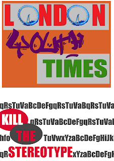 Upon feedback from my target market, I realised that I needed some form of iconic imagery that links my newspaper to the location/s I’m representing. I decided to replace the O’s of the word ‘London’ with wheel of the London Eye. It also seemed as though my logo/ masthead isn’t as recognisable as I’d like it to be. Therefore I decided to use my instead of including it as part of the word search. Secondly, I took on board the opinion that there was too much text and decreased the lines to only the slogan ('Kill The Stereotype').
 Upon feedback from my target market, I realised that I needed some form of iconic imagery that links my newspaper to the location/s I’m representing. I decided to replace the O’s of the word ‘London’ with wheel of the London Eye. It also seemed as though my logo/ masthead isn’t as recognisable as I’d like it to be. Therefore I decided to use my instead of including it as part of the word search. Secondly, I took on board the opinion that there was too much text and decreased the lines to only the slogan ('Kill The Stereotype').
 Third draft: Final Template
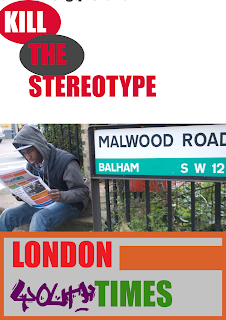
I although my second draft looked good, it didn’t really reflect my target audience. I decided therefore to include an image of a teenager reading my newspaper. I also realised that my masthead on my poster isn’t the same as the one on the newspaper so including the wheel of the London Eye may confuse my readers. Therefore, to incorporate my product, audience and iconic image (a representation of where my newspaper is based), I decided to take a picture of a young teenager sat on the upper deck of a bus on Westminster Bridge with the London Eye in the background. This is my final draft.

I chose the road across my college with the road sign to indicate the distribution/ location of my newspaper (South West which is based in London) and decided to have a teenage model who is ‘casually dressed’ and accurately representative of the fashion trends that are normal within the teenage males. The aim of the newspaper is also identified here; the slogan ‘Kill the Stereotype’ is connoted in the image. Rather than stealing things, vandalising property (graffiti), they are educating themselves on the positive news on youth in their community.
Here’s the feedback I received in regards to my ancillary task 1:
I should include the following:
- add other countertypes that in effect ‘kill the stereotype’
- don’t limit geographical area
- cost
- frequency
Following the feedback I’ve received, I decided to create more countertypes and give them names that are recognisable in youth language (e.g. ‘The Hood Rat’ who is well known for their street wise credibility/ well known on the streets). I’d give them these names and state what news section they are reading to actually carry out a double meaning in the sense that although they ‘look’ like hood rats, they aren’t actually hood rats. Therefore the saying; don’t judge a book by its cover is brought out here.
Secondly, seeing as my masthead states ‘London’ it does make sense to not narrow the geographical area as much as I have. I will therefore take pictures of in mise- en- scenes that don’t necessarily bring out any specific area to connote distribution. My feedback also suggested maybe including the frequency, and cost of my newspaper into the poster. I decided to create a table with my intentions for each of the images in my poster.
This is the final draft of my newspaper

Analysis/ Evaluation:
Here’s the feedback I received in regards to my ancillary task 1:
I should include the following:
- add other countertypes that in effect ‘kill the stereotype’
- don’t limit geographical area
- cost
- frequency
Following the feedback I’ve received, I decided to create more countertypes and give them names that are recognisable in youth language (e.g. ‘The Hood Rat’ who is well known for their street wise credibility/ well known on the streets). I’d give them these names and state what news section they are reading to actually carry out a double meaning in the sense that although they ‘look’ like hood rats, they aren’t actually hood rats. Therefore the saying; don’t judge a book by its cover is brought out here.
Secondly, seeing as my masthead states ‘London’ it does make sense to not narrow the geographical area as much as I have. I will therefore take pictures of in mise- en- scenes that don’t necessarily bring out any specific area to connote distribution. My feedback also suggested maybe including the frequency, and cost of my newspaper into the poster. I decided to create a table with my intentions for each of the images in my poster.
Representation | What is the individual reading? | What is the individual supposed to read according to society? | What stereotype does it 'kill'? |
The ‘Hood’ girl  | Politics | Entertainment/ latest raves | - The idea that she is actually interested in educating herself on what is going on in the local community- not only interested in entertainment Not an all play and no work kind of girl- she actually wants to learn about something other than entertainment. |
The ‘Hood rat’  | Current news | Sports/ not even supposed to be reading a newspaper (a rarity) | - The same stereotype applies to this context; he doesn’t want to cause trouble but wants to see what is going on in the world outside his. The ‘hood’ boy wants to know about the trouble that is being caused however they don’t want to be a part of it. |
The ‘Neek’   | The latest raves/ reviews | Politics/ current news seeing as he is a ‘geek’ | - This individual is supposed to represent those who are seen as ‘all work and no play’; they are viewed to have no sense of fun. This aspect kills this view in the sense that you wouldn’t expect a geek to be out in raves, you’d expect them to be at home, reading their books. Well this is saying that actually they are humans and they DO have a sense of fun |
This is the final draft of my newspaper

Analysis/ Evaluation:
As there weren’t a lot of generic conventions that I could really conform or challenge I tried to ensure that I stuck to the generic conventions of posters in general. This conforms to the theory of Jacques Derrida: (The law of genre, 1981): 'a text cannot belong to no genre, it cannot be without... a genre. Every text participates in one or several genres, there is no genreless text.’ This theory implies that I must follow the conventions to a certain extent at least; even if it means following the conventions of posters and not newspaper posters.
I included the frequency, price, website and a variety of images to show more of a varied representation in terms of race. There is sense of identity here as my target audience know immediately that whatever is being advertised is for them. As well as that, I’ve incorporated a lot of vibrant energy that will show enthusiasm and draw my target audience to at least know what all the excitement is about.
Male and Female representation in Ancillary Task 1 (poster): I wanted to countertype the views people have about young teenagers and the stereotype society creates based on the way they are dressed. The aim of the costume choices for my models was to play the guess game with individuals who try to stereotype/judge people’s characters based on how they look. The images show them reading my newspaper and they are supposed to guess what the readers are reading based on the way they look. This will cause a preferred/ dominant reading within my target audience because this clearly gives them a reason to want to break that stereotype and show that society needs to look beyond the looks.
Representation of race/ ethnicity: Those who belong in ethnic minority group particularly those of black descent. As my newspaper focuses on minority groups who have been discriminated against predominantly those of black ethnicity I am therefore showing a positive representation of these races and challenging the way the mass media views them. I am also challenging what theorist’s say about the representation of black people. Amantia Diawara suggests that men are seen as ‘aggressive’ and ‘violent’ and women are seen as ‘mammy’s’. I challenged this theory by representing men as well established individuals e.g. the model I used for the image with ‘Raves’ written on it is smartly dressed and comes across as intellectual, not ‘aggressive’ or ‘violent’. I also broke the idea that those who may be seen as ‘aggressive’ and ‘violent’ because of the way they look isn’t always a reflection of their character; my male model with the word ‘news’ suggests that although he looks like ‘he’s no good’, he actually is because he wants to learn about the current news in his community which shows a sense of intellect.